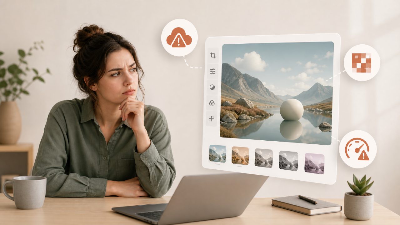
I started testing Vizly Image Studio because I needed a quick graphic for a blog header and didn’t want to open Photoshop. The idea of turning text into a usable visual in minutes sounded perfect. But after a few sessions, I hit some real gotchas that anyone considering this tool should know about.
The prompt trap: more isn’t better
Vizly can generate decent graphic assets, but only if you get the prompt right. My first mistake was overloading it with details like “modern minimal infographic with blue gradient and small icons in top corner.” The result was a noisy mess – too many elements fighting for space. It does better with simpler, more abstract prompts like “clean abstract background for a tech blog.” The gotcha: you can’t treat it like a design brief. It interprets literally, so any conflicting detail shows up as clutter.
Free has limits (and they matter)
There’s buzz about this being a free ai image and video generator 2026 tool, but the free tier is narrower than you’d hope. I hit a limit after about a dozen generations, and the resolution for the free output is around 512×512 – fine for thumbnails, not for print or hero images. The paid tiers unlock higher resolutions, but then you’re paying per month. If your goal is professional-grade marketing graphics, the free tier won’t get you there. It’s more for brainstorming or mockups.
Inconsistent style makes branding tough
One scenario that tripped me up: I needed a series of social media graphics with the same look. I reused nearly identical prompts – “flat illustration style, pastel colors, corporate feel” – and got wildly different results. One looked cartoonish, another felt more realistic. Vizly doesn’t have a style lock feature yet. So if you’re building a brand kit, you’ll spend a lot of time cherry-picking or editing. That’s a realistic tradeoff: it’s a great idea generator, but not a consistent graphic design tool.
Text in images? Don’t count on it
I tried generating a simple quote graphic with “Stay Curious” as text. The letters were mangled, blurred, or partially missing. vizly (the product name itself) handles text poorly unless it’s integrated into a scene like a sign or billboard. For text-heavy graphics like posters or infographics, you’re better off adding text later in Canva or Photoshop. That’s a clear limitation – not a dealbreaker, but a real friction point if you expected all-in-one.
Video generation is mostly theoretical
You’ll often see mentions of ai text to image video generator free capabilities. Vizly does have a video mode, but it’s clearly in beta. I tried generating a short looping clip for a product demo – the motion was jerky, and the duration maxed out at 3 seconds. It works for experimental content, but don’t plan a video campaign around it. The results feel more like a proof-of-concept than a deliverable.
When is it actually useful?
After these gotchas, I still find Vizly useful for two things: sparking visual ideas (like “what would a futuristic coffee shop look like?”) and creating placeholder graphics for wireframes. For actual finished graphic design – logos, ads, polished blog images – it’s not ready. But as a low-friction exploration tool, it saves minutes per idea. Just go in expecting to iterate, not to generate final work in one click.
If you’re comparing it to other tools, know that the vizly ai image generator is mid-range on output quality but strong on prompt interpretation simplicity. It won’t replace a designer, but it’ll get you a rough draft fast – as long as you avoid the traps above.
Comments
Leave a Comment